 Debugger script
Dhtml css
Debugger script
Dhtml css
As previously stated, if your image contains less than 256 colors or contains text that you want sharply rendered, you should save your image as a GIF image. When doing so, most image editors provide you with a couple options: saving your image with the default 256-color palette or with an optimized palette.
Using HTML alone, you can only display fonts that are available on a user's system. By creating your own text banner graphic, however, you can use any font that is available on your system. Besides choosing any font on your system, you can fill the text with a color, gradient blend, or pattern, as well as apply various other effects to the text, such as a drop shadow, inner and outer bevels, and so on. You may also be able to distort or bend your text object in varying ways.
To create a text banner in Paint Shop Pro 8, do the following:
Select File, New, to create a new image. Set the width to 500 pixels and the height to 75 pixels, for instance. Leave the other options as they are (Raster Background and 16 Million Colors). Click OK.
Select the Text tool (the "A" tool). On the Tool Options palette, specify a Floating image. Choose a font and font size (Arial Black font face, 44-pixel size, and bold font style, for instance).
On the Materials palette there are two overlapping boxes. When the Text tool is selected, the foreground box sets the outline color, while the background box sets the fill color. If the foreground box is not grayed out, click the third push button on the bottom of the foreground box to set the outline to be transparent.
Click inside the background box and select a fill color for the text; click OK.
Click the mouse cursor inside of the image and type the text for your text banner ("My Home Page," for instance). Click the Apply button.
Click and drag the text object to position it in the center of the image.
Apply any effects you want to apply to the image. For instance, to apply an inner bevel effect to the text object, select Effects, 3D Effects, and Inner Bevel. Set any options you like and click OK. (See Figure C.1.)
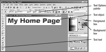
Figure C.1: A text object with an inner bevel effect is created.
The most recent version of the GIF image format (Version 89a) supports the saving of interlaced images. An interlaced GIF image is displayed in four passes, with progressively more lines filled in on each of the last two passes. A user gets to see what an image is going to look like long before it has finished being downloaded and, hopefully, will be less inclined to simply click the Back button before the page's content has finished downloading.
| BUZZ WORD |
The term interlacing originates from television technology—a television picture is formed by first scanning the odd lines (1, 3, 5, and so on) and then scanning the even lines (2, 4, 6, and so on). Some early computer monitors also used interlacing to mimic displaying higher resolutions than they were otherwise capable of displaying. |
Most image editors should allow you to save an interlaced GIF image. For instance, to save an interlaced GIF image in Paint Shop Pro 8, just do the following:
Select File, Save As, and select Compuserve Graphic Interchange (*.gif) as the image type. Click the Options button. Leave Version 89a selected. Select Interlaced. Click OK.
Navigate to where you want to save the image (the AppC folder in the MyHTML folder, for instance). Type a file name for the image, adding ".gif" as the extension. Click the Save button to save the image.
Click Yes to reduce the saved image to a single layer and a maximum of 256 colors. (This is applied to the saved image, but not to the image that remains in the image editor.)
The GIF image format also lets you save an image with one color displayed as transparent. This allows you to display an image on a Web page, for instance, with the page's background color or image showing through the transparent areas of your image. To specify the background color of a text banner as transparent, you would do the following in Paint Shop Pro 8:
Select Image, Palette, and Set Palette Transparency. Click OK to flatten the image's background to a single layer and reduce the color-depth to 256 colors.
Pass the mouse cursor over and click the image's white background to specify that it will be transparent (see Figure C.2). Click OK.
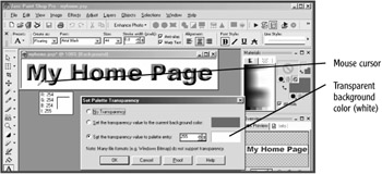
Figure C.2: The image's white background color is set as transparent.
You can view the transparent areas of your image. Select Image, Palette, and View Palette Transparency. The transparent background color is displayed in a gray checkerboard pattern (see Figure C.3).
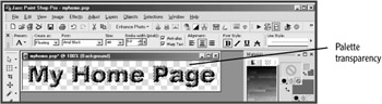
Figure C.3: In Paint Shop Pro 8, you can view the transparent areas of your image (as a checkerboard pattern).
Select File, Save (or Save As), and select CompuServe Graphic Interchange (*.gif) as the image type. Type a name for your image (myhome1.gif, for instance). Click the Options button and select Interlacing (if not already set). Navigate to where you want to save your image (the AppC folder in your MyHTML working folder, for instance) and click the Save button.
To see your transparent GIF image in action, you need to insert it in a Web page with a background color or image set. An example Web page has already been created for you that shows a transparent GIF image displayed against a background image. In your browser, just open myhome_trans.html from the AppC folder (see Figure C.4).
Turning on anti-aliasing for text in a banner image (or for other "display" text in an image) can help to improve the appearance of the text.
| BUZZ WORD |
Anti-aliasing blends the edges of the letterforms with the background, so that diagonals and curves are less likely to display what is often referred to as the "jaggies" (or a "staircase" effect). For best results, anti-aliasing should only be turned on for text that is larger than 16 pixels in size; for text smaller than that, anti-aliasing can cause text to appear blurry. |
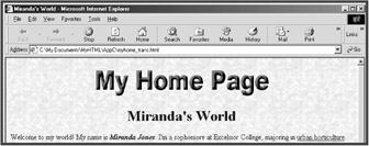
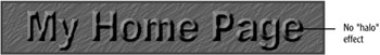
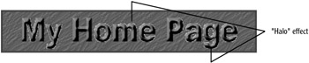
However, if you want to display a text banner saved as a transparent GIF, you need to be mindful that turning on anti-aliasing for the text in your image can cause problems when you display your image in a Web page with a dark background (or a background color or image that is significantly different in color from your image's background). That is because anti-aliasing blends the edges of letterforms with the image's background color; for instance, if your image's background color is white, but your Web page's background color or image is a dark color, you will see a very noticeable white "halo" effect displayed around the image's letterforms. An example file, myhome_halo.html, that demonstrates this in action is available with the other example files (see Figure C.5).
The easiest way to overcome this problem is to turn off anti-aliasing (uncheck the Anti-alias check box on the Tool Options palette in Paint Shop Pro 8) when creating text in an image that you want to display transparently against a Web page's dark background. The example file, myhome_dark.html, shows this; just open it in your browser to take a look (see Figure C.6).
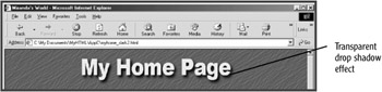
Creating a drop shadow effect for a banner image's text can be quite effective. This can, however, run into the same problem encountered when trying to use anti-aliased text in a transparent GIF, where the backgrounds of the image and the page differ significantly in color. A drop shadow effect is melded with the image's background color. The way around this is to match your image's background color to your Web page's background color (or to the principal color included in a background color). You do this by opening your page's background image in your image editor, picking up and assigning a color from the background image as the foreground fill color (in Paint Shop Pro 8, you do this by selecting the Dropper tool and clicking it inside the background image).
You then use your image editor's fill tool (the Flood Fill tool on Paint Shop Pro 8's toolbar, for instance) to fill the background of your image with the color you picked up from the background image. To see an example, open myhome_dark2.html from the AppC folder in your MyHTML folder (see Figure C.7).
| Tip |
If your image editor doesn't have a drop shadow effect that can be applied to text, there's another way you can do it. First, create a text object and apply a blur or motion effect to it (apply it two or three times, if necessary). Next, create a second text object (using the same text and font settings) and overlap it over the first text object, but offset above and to the left. Voila! You have a drop shadow! |
GIF images are limited to containing only 256 simultaneous colors. There are a number of different ways you can use color palettes with GIF images, however, that can increase the versatility of GIF images. By default, an image editor may save a GIF image using the system palette, the Web-safe palette, or an optimized palette.
The system palette is composed of the default 256 colors that can be displayed on a 256-color system. Thus, it may contain many colors that are not present in an image, and an image may contain many colors that are not present in the system palette. The system palettes for the Windows and Macintosh system also do not contain the same 256 colors, which can lead to colors not displaying the same on those two platforms. The Web-safe palette is a palette of 216 colors that are included in most system palettes. This is better than the system palette and can help ensure that viewers using 256-color systems will be able to see colors included in the palette undithered. The Web-safe palette is sometimes called the Netscape palette, since it was Netscape that first introduced it in its Navigator browsers.
An optimized color palette is restricted to only colors that are contained within an image, whereas the system and Web-safe color palettes can contain many colors not contained within an image. Because an optimized palette contains only colors that are present in the image, the need for dithering is reduced. Any colors not in the palette still have to be dithered to be displayed (the image is still restricted to displaying 256 simultaneous colors), but because the palette contains only colors present in the image, it includes a much better selection of colors from which dithered colors can be composed, resulting in more effective dithering when it has to be done.
Saving a GIF image with an optimized color palette allows colors in the palette to be chosen from any of 16.7 million possible colors, although no more than 256 simultaneous colors can be displayed. Because all colors available in the palette correspond to colors that are present in the image, degradation of image quality from the original can be relatively minor, at least as far as display on the Web is concerned.
Paint Shop Pro 8 automatically saves GIF images with an optimized 256-color palette, which contains only colors that are present within an image. Other image editors, however, may default to saving GIF images using the system palette or the Web-safe palette.
You can further optimize a GIF image by reducing the number of colors included in an optimized palette to less than 256. The fewer colors you can get away with including in a GIF image's palette, the smaller the image will be in bytes. For instance, a line art image may not contain more than 8 total colors; with such an image, any palette with more than 8 colors is just wasted colors and bytes. By creating an 8-color optimized palette composed only of colors contained within an image, you can dramatically reduce the number of bytes the image will consume.
| Note |
In Adobe Photoshop, an optimized palette is called an adaptive palette. To save a GIF image with an adaptive palette and using error diffusion in Photoshop 7, select File, Save for the Web, and then select GIF, Adaptive, and Diffusion as the first three options. |
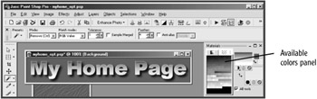
To optimize a color palette for an image you want to save as a GIF image in Paint Shop Pro 8, first select Image, Decrease Color Depth, and X Colors (4/8 bit). Click OK to flatten the image to a single layer. Select 216 as the number of colors, for instance, leave Optimized Median Cut selected, and select Nearest color as the reduction method. Leave all other options as they are. Click OK. Notice that the panel of available colors (in the Materials tool palette) is now displaying only 256 colors that are included within the image, instead of the full range of 16.7 million colors from the 24-bit color palette (see Figure C.8).
Selecting Error diffusion, instead of Nearest color, as the reduction method may result in an image's non-white background color being diffused into more than one color, which is not something you want if you plan to also set your image's background to be transparent. If that happens, select Nearest color as the reduction method. You can also try increasing the total number of colors you're including in the palette.
Alternatively, you can let the error diffusion occur in the image background, and then use a solid fill with the tolerance level set high enough to re-fill the image background with a single color (but not set so high that it eats too far into any drop shadow effect, for instance).
The further you can reduce the number of colors (to 128, 64, or 32 colors, for instance), the smaller your image will be in bytes. You can save test images using optimized palettes with progressively fewer colors and then reopen both the original image and your test images in your image editor, so you can compare them. The image with the best mix of image quality and bandwidth conservation wins.
Recent image editors may also include wizards or utilities that help to automate optimizing a GIF image. For instance, in Paint Shop Pro 8, to access its GIF Optimizer, select File, Export, GIF Optimizer. Click the Colors tab and select the Optimized Median Cut method. You can then experiment with color palettes with different numbers of colors, comparing their visual quality and fidelity with the number of bytes saved. Paint Shop Pro 8's GIF Optimizer also let you experiment with the amount of dithering to be allowed and the color reduction method. Reducing the amount of allowed dithering to 50% and selecting the Optimized Octree color-reduction method, for example, can result in even further reductions in the number of bytes required to maintain acceptable image quality and fidelity.
Debugger script
Dhtml css