
Setting the Font Size
There are two basic ways to set the font size for the text in your Web page. You can mandate that a specific size be used or you can have the size depend on the element's parent.

To mandate a specific font size:
1. | Type font-size:.
| 2. | Type an exact size: say, 16px or 1em.
Or use a keyword to specify the size: xx-small, x-small, small, medium, large, x-large, or xx-large.
|

 Tips Tips
See page 124 for details about units. There shouldn't be any spaces between the number and the unit. The average pixel is about 1/80th of an inch high (1/32 cm), though it depends on the screen resolution. Imagine a 17" monitor, whose screen is roughly 12.5" wide, with a resolution of 1024 x 768. At that resolution, text at 16 pixels would be about 1/5 of an inch high (about 1/2 cm). If you set the font size with pixels, visitors using Internet Explorer (up to and including version 7) will not be able to make the text bigger or smaller with the Text Size option. (Zoom still works.) Only use points, cm, mm, or picas in style sheets that format printed output (see page 209). Different browsers interpret the keywords in different ways. Explorer 5.x uses small as its base size while IE 6, Opera, and Netscape use medium. The font-size property is inherited.
To set a size that depends on the parent element's size:
1. | Type font-size:.
| 2. | Type the relative value, say 1.5em or 150%.
Or use a relative keyword: larger or smaller.
|
Tips
The new size is determined by multiplying the percentage or em factor by the parent element's size. For example, if the body is set to 16 pixels, a p element contained in it with a relative value of 75% will be displayed at 12 pixels. The parent element's size may be set by you (the designer), may be inherited, or may come from the browser's defaults. On most current browsers, the default size for the body element is 16 pixels.
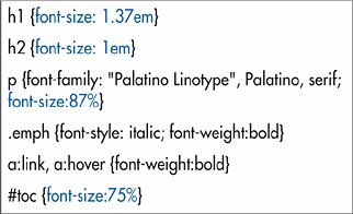
The child of an element with a relative size inherits the size, not the factor. So, an em element in the p in the first tip would inherit a size of 12 pixels, not a relative value of 75% (which would be strange). An em is equal to the size of the font. So 1 em equals 100%. Ems and percentages are well supported in current browsers. You can set font size together with other font values (see page 159).

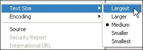
Sizes specified with ems and percentages are more elastic. You can change the design by changing just the base size. And visitors can change the base size with their browser's Text Size command. There's also an ex unit, which refers to the x-height of the parent element, but it is not widely supported.
|
 Best javascript editor debugger
Ajax website
Best javascript editor debugger
Ajax website