 JavaScript Editor
JavaScript Debugger
JavaScript Editor
JavaScript Debugger|
| ||
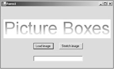
Picture boxes are used to display graphics from a bitmap, icon, JPEG, GIF or other image file type. You can see a picture box—from the PictureBoxes example on the CD-ROM—at work in Figure 7.4.
To display an image in a picture box, you can set the Image property to the image you want to display, either at design time or at run time. You can clip and position an image with the SizeMode property, which you set to values from the PictureBoxSizeMode enumeration:
Normal— Standard picture box behavior (the upper-left corner of the image is placed at upper left in the picture box).
StretchImage— Allows you to stretch the image in code.
AutoSize— Fits the picture box to the image.
CenterImage— Centers the image in the picture box.
You also can change the size of the image at run time with the ClientSize property, stretching an image as you want. By default, a PictureBox control is displayed without any borders, but you can add a standard or three-dimensional border using the BorderStyle property. And you can even handle events such as Click and MouseDown to convert an image into an image map, as we'll see later in this chapter.
For more details on all these controls, see the Immediate Solutions section, coming right up.
|
| ||
Free JavaScript Editor
JavaScript Editor