 JavaScript Editor
JavaScript Debugger
JavaScript Editor
JavaScript Debugger|
| ||
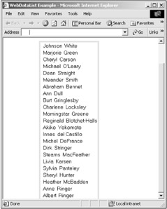
You use a data list to display a data-bound list of items. The formatting of each item is handled with templates, and we'll see how to create those templates in this chapter. To see how to use data lists, take a look at the WebDataList example on the CD-ROM, which you see in Figure 23.7. This example displays the first and last names of all the authors in the authors table in a data list, formatted with a simple border around the list. Each row in the list is created with a template, and in this case, that template is a label control bound to the first name of an author, followed by a space, and a second label control bound to the last name of an author. This is a very simple template; you can add all kinds of HTML to customize templates as you like.
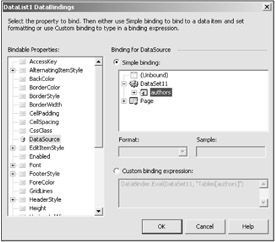
To follow along in this example, create a Web application now and add a dataset corresponding to the authors table. How do you actually bind the controls in a template to a data source? You start by binding the data list to a data table. To do that, create a dataset and use the (DataBindings) property of the data list to bind the data list to the authors tables, shown in Figure 23.8.
Next, to create a template to display a data item, right-click the data list and select the Edit Templates|Item Template item. This displays the templates used to display data items, as you see in Figure 23.9. In the Item Template line, place a label control, Label1, followed by a space, and another label, Label2, as you see in the figure. That creates an item template, which is used to display data items. Now we have to bind the labels to the authors' first and last names.
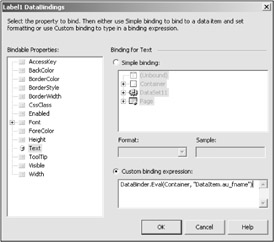
To bind the labels to the au_fname and au_lname fields, start by selecting the first label's (DataBindings) property in the properties window, opening the DataBindings dialog you see in Figure 23.10.
In the DataBindings dialog for the first label, click the "Custom binding expression:" radio button and enter this custom binding expression:
DataBinder.Eval(Container, "DataItem.au_fname")
This binds the label to the au_fname field. In the same way, bind the second label to the au_lname field with this custom binding expression:
DataBinder.Eval(Container, "DataItem.au_lname")
To stop editing the template, right-click the data list and select the "End Template Editing" item. And, of course, don't forget to fill the dataset with data from the adapter when the page loads and bind the data list to the dataset with this code:
Private Sub Page_Load(ByVal sender As System.Object, _
    ByVal e As System.EventArgs) Handles MyBase.Load
    DataSet11.Clear()
    OleDbDataAdapter1.Fill(DataSet11)
    DataList1.DataBind()
End Sub
And that's all you need-now when you run the program, you'll see the display in Figure 23.7.
We've seen the Item Template now, which is the only template that you're required to create in order to display a data list, but there are others. Here are all the supported templates for data lists:
AlternatingItemTemplate- Specifies content and layout for alternating items.
EditItemTemplate- Specifies content and layout for the item being edited.
FooterTemplate- Specifies content and layout for the footer.
HeaderTemplate- Specifies content and layout for the header.
ItemTemplate- Required template that specifies content and layout for displayed items.
SelectedItemTemplate- Specifies content and layout for selected items.
SeparatorTemplate- Specifies content and layout for separators between items.
You also can customize the appearance of a data list with various style properties, and here they are:
AlternatingItemStyle- Specifies the style for alternating items.
EditItemStyle- Specifies the style for the item being edited.
FooterStyle- Specifies the style for the footer.
HeaderStyle- Specifies the style for the header.
ItemStyle- Specifies the style for the displayed items.
RepeatDirection- Specifies the display direction of a data list; can be vertical or horizontal.
RepeatLayout- sets the layout of the data list; setting this property to RepeatLayout.Table will display data in a table format; RepeatLayout.Flow displays data without a table format.
SelectedItemStyle- Specifies the style for selected items.
SeparatorStyle- Specifies the style for separators between items.
In addition, data lists support several events:
ItemCreated- Gives you a way to customize the item-creation process at runtime.
ItemDataBound- Gives you the ability to customize the DataList control, but after the data is available for examination.
You can display buttons in items in a data list, as we've displayed labels in the WebDataList example, and certain events are connected to those buttons depending on the buttons' CommandName properties. For example, if the Command Name of a button is "edit", clicking that button will cause an EditCommand event to occur; if the CommandName of a button is "delete", clicking that button will cause a DeleteCommand event to occur. Here are the possible events:
EditCommand- Occurs when a button with the CommandName "edit" is clicked.
DeleteCommand- Occurs when a button with the CommandName "delete" is clicked.
UpdateCommand- Occurs when a button with the CommandName "update" is clicked.
CancelCommand- Occurs when a button with the CommandName "cancel" is clicked.
There's also an ItemCommand event that occurs when a user clicks a button that doesn't have a predefined command.
|
| ||
Free JavaScript Editor
JavaScript Editor