 JavaScript Editor
JavaScript Debugger
JavaScript Editor
JavaScript Debugger|
| ||
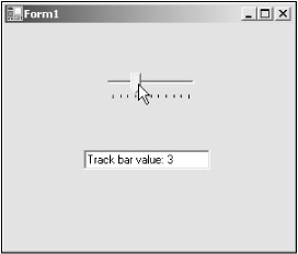
Track bars are very much like scroll bars but differ in appearance. Track bars look more like controls you might see on stereos-you can see one at work in Figure 8.3. As that figure shows, track bars do much the same work as scroll bars do-let the user specify numeric values from a continuous range.
You can configure a track bar's range with the Minimum (default = 0) and Maximum (default = 10) properties. You can specify how much the Value property should be incremented when clicks occur to the sides of the slider by means of the LargeChange (default = 5) property, and how much when the user uses arrow keys when the control has the focus with the SmallChange property (default = 1). A track bar can be displayed horizontally or vertically-you set its orientation with the Orientation property.
You also can configure track bars with the TickStyle property, which lets you determine how ticks are displayed; this property can take values from the TickStyle enumeration:
Both- Tick marks are located on both sides of the control.
BottomRight- Tick marks are located on the bottom of a horizontal control or on the right side of a vertical control.
None- No tick marks appear in the control.
TopLeft- Tick marks are located on the top of a horizontal control or on the left of a vertical control.
You also can set the tick frequency, which sets the distance between ticks, with the TickFrequency property (the default is 1).
|
| ||
Free JavaScript Editor
JavaScript Editor