 JavaScript Editor
JavaScript Debugger
JavaScript Editor
JavaScript Debugger|
| ||
Image list components are designed to work with controls that support two properties: ImageList and ImageIndex. Those controls are list views, tree views, toolbars, tab controls, checkboxes, buttons, radio buttons, and labels. You associate an image list with the control using the ImageList property and set which image from that list is displayed in the control with the ImageIndex property (for example, setting ImageIndex to 0 makes the control display the first image in the image list).
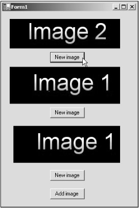
You can see how this works in the ImageLists example on the CD-ROM, which appears in Figure 10.1—the top image there is displayed in a label whose ImageList property is set to the image list component in the example, ImageList1, and whose ImageIndex property starts off at 0. When the user clicks the "New image" button in that example, I cycle through the available images by changing the ImageIndex property, like this:
Private Sub Button1_Click(ByVal sender As System.Object, _
    ByVal e As System.EventArgs) Handles Button1.Click
    If Label1.ImageIndex < ImageList1.Images.Count - 1 Then
        Label1.ImageIndex += 1
    Else
        Label1.ImageIndex = 0
    End If
End Sub
You can see the results in Figure 10.9, where I've clicked the "New image" button under the label to display the second image.
|
| ||
Free JavaScript Editor
JavaScript Editor