 JavaScript Editor
JavaScript Debugger
JavaScript Editor
JavaScript Debugger|
| ||
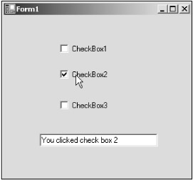
Checkboxes are also familiar controls—you click a checkbox to select it, and click it again to deselect it. When you select a checkbox, a check appears in it, indicating that the box is indeed selected. You use a checkbox to give the user an option, such as true/false or yes/no. The checkbox control can display an image or text or both. You can see some checkboxes at work in Figure 6.2 and in the CheckBoxes example on the CD-ROM.
You can use the Appearance property to specify if the checkbox appears as a typical checkbox or as a button. And the FlatStyle property determines the style and appearance of the control. If the FlatStyle property is set to FlatStyle.System, the user's operating system sets the appearance of the control.
Also, the ThreeState property determines whether the control supports two or three states. For standard checkboxes, you use the Checked property to get or set the value of a checkbox control, but for three-state checkboxes, which support an "indeterminate" state, you use the CheckState property. The indeterminate state is sort of a middle state between checked and unchecked. For example, if you use a checkbox to specify that selected text in a text control of some type should be in italics, but have selected text that is partly normal and partly italic text, the checkbox can show the indeterminate state—in which a checkbox appears on a gray background—to show that neither the checked nor the unchecked states fully apply.
|
| ||
Free JavaScript Editor
JavaScript Editor