 JavaScript Editor
JavaScript Debugger
JavaScript Editor
JavaScript Debugger|
| ||
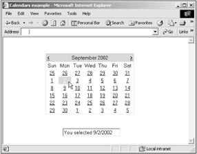
You use the Calendar control to display a single month of a calendar on a Web page. This control allows you to select dates and move to the next or previous month. You can choose whether the Calendar control allows users to select a single day, week, or month by setting the SelectionMode property.
By default, the control displays the days of the month, day headings for the days of the week, a title with the month name, and arrow characters for navigating to the next and previous month. You can customize the appearance of the Calendar control by setting the properties that control the style for different parts of the control. Here are the properties that you can use to customize a calendar control:
DayHeaderStyle— Sets the style for the days of the week.
DayStyle— Sets the style for the dates in a month.
NextPrevStyle— Sets the style for the navigation controls.
OtherMonthStyle— Sets the style for dates not in the displayed month.
SelectedDayStyle— Sets the style for the selected dates.
SelectorStyle— Sets the style for the week and month selection column.
TitleStyle— Sets the style for titles.
TodayDayStyle— Sets the style for today's date.
WeekendDayStyle— Sets the style for weekend dates.
It's also worth knowing that you can show or hide different parts of a calendar. Here are the properties to use for this:
ShowDayHeader— Shows or hides the days of the week.
ShowGridLines— Shows or hides grid lines (displayed between the days of the month).
ShowNextPrevMonth— Shows or hides the navigation controls to the next or previous month.
ShowTitle— Shows or hides the title.
When the user makes a selection, you can use the SelectionChanged event and the SelectedDate property to find the new selected date. That's how the Calendars example on the CD-ROM, which you can see in Figure 18.3, works. As it shows, I'm selecting a date.
|
| ||
Free JavaScript Editor
JavaScript Editor