 JavaScript Editor
JavaScript Debugger
JavaScript Editor
JavaScript Debugger|
| ||
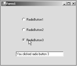
Radio buttons, also called option buttons, are similar to checkboxes—the user can select and deselect them—except for two things: they are round where checkboxes are square, and you usually use radio buttons together in groups.
In fact, that's the functional difference between checkboxes and radio buttons—checkboxes can work independently, but radio buttons are intended to work in groups. When you select one radio button in a group, the others are automatically deselected. For example, although you might use checkboxes to select trimmings on a sandwich (of which there can be more than one), you would use radio buttons to let the user select one of a set of exclusive options, such as the current day of the week. You can see radio buttons at work in Figure 6.3 and in the RadioButtons example on the CD-ROM.
When the user selects one radio button in a group, the others clear automatically. All radio buttons in a given container, such as a form, make up a group. To create multiple groups on one form, you place each additional group in its own container, such as a group box or panel control.
Like checkboxes, you use the Checked property to get or set the state of a radio button. Radio buttons can display text, an image, or both. Also, a radio button's appearance may be altered to appear as a toggle-style button or as a standard radio button by setting the Appearance property.
|
| ||
Free JavaScript Editor
JavaScript Editor